Design Guide


Stories and Shopping Ideas
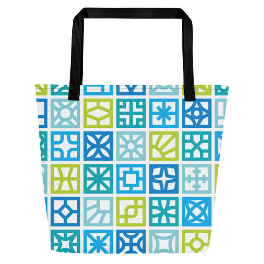
Breeze Blocks
-
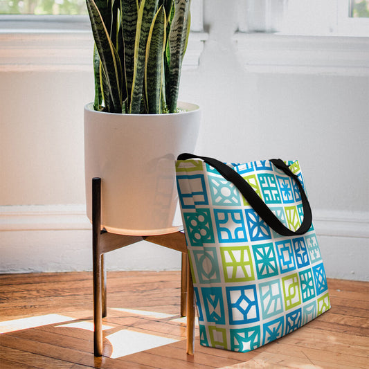
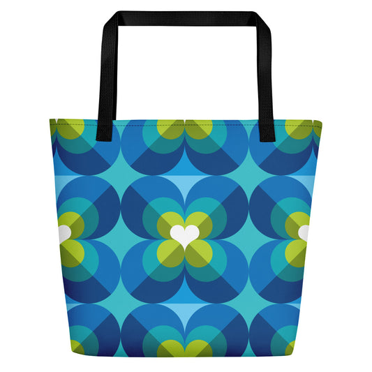
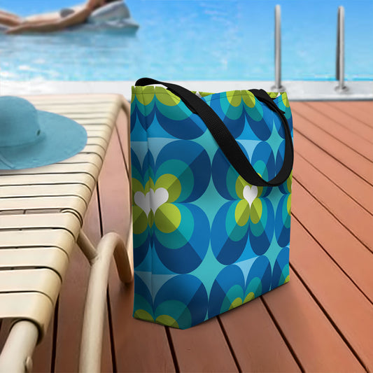
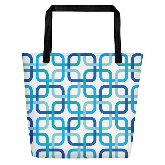
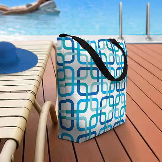
Mid Century Modern Blue Breeze Blocks Beach Bag
Regular price $40.00Regular price -
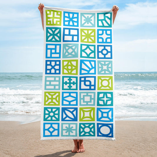
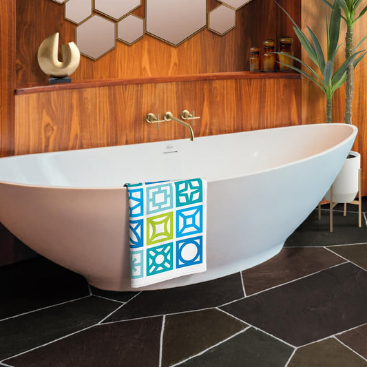
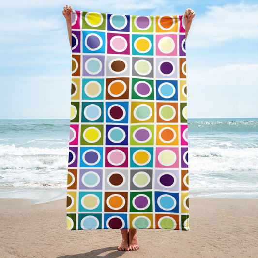
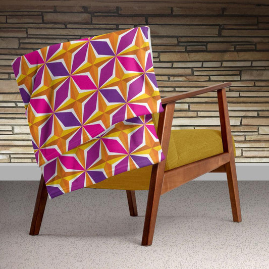
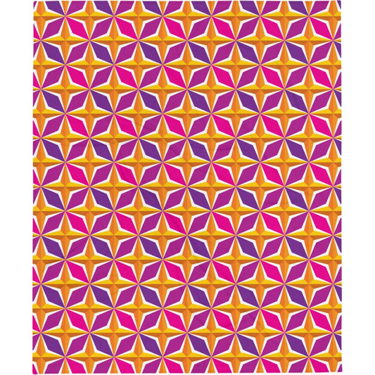
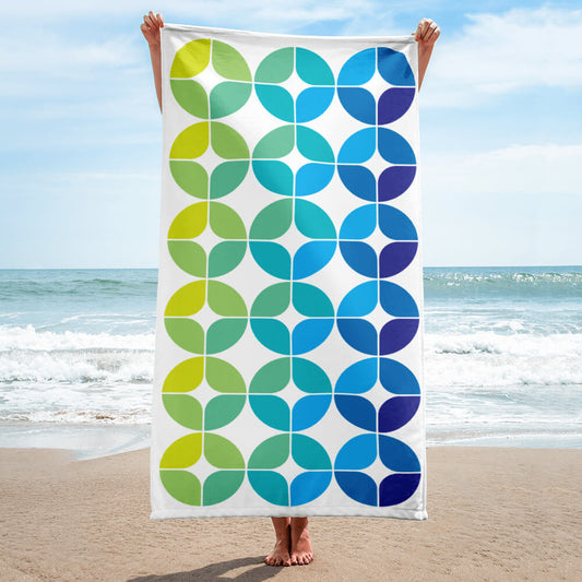
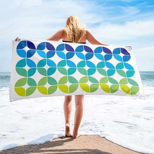
Mid Century Modern Blue Breeze Blocks Beach & Pool Towel
Regular price $40.00Regular price -
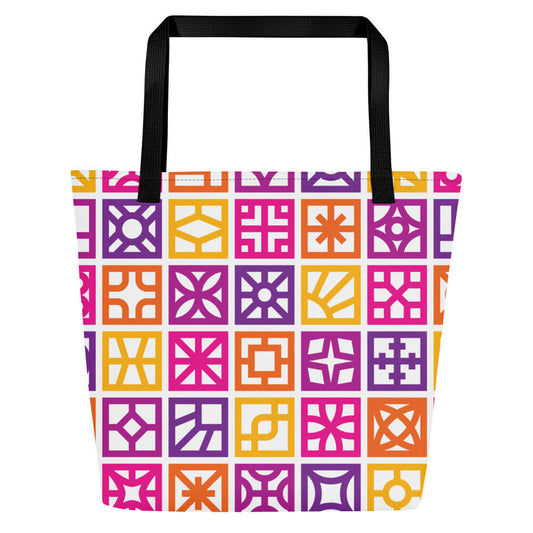
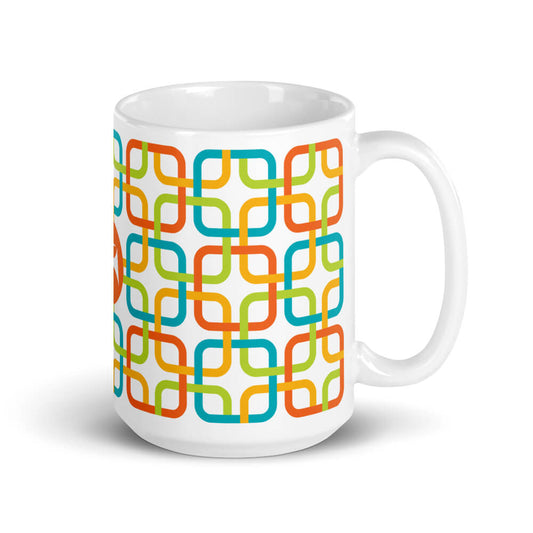
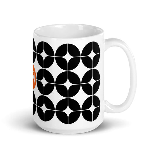
Mid Century Modern Orange Breeze Blocks 11oz Mug with Color Inside
Regular price $25.00Regular price -
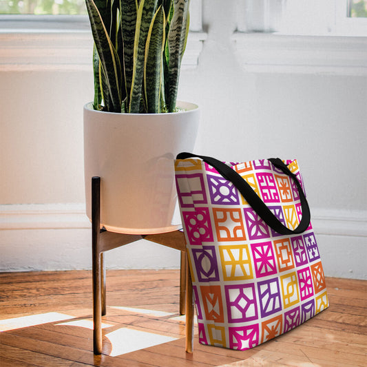
Mid Century Modern Orange Breeze Blocks Beach Bag
Regular price $40.00Regular price


Eclipse
-
Mid Century Modern Moon Eclipse Beach & Pool Towel
Regular price $40.00Regular price -
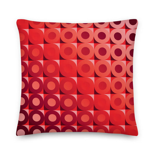
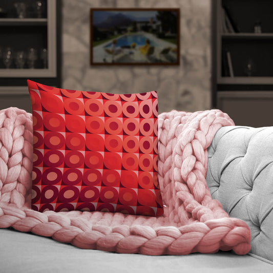
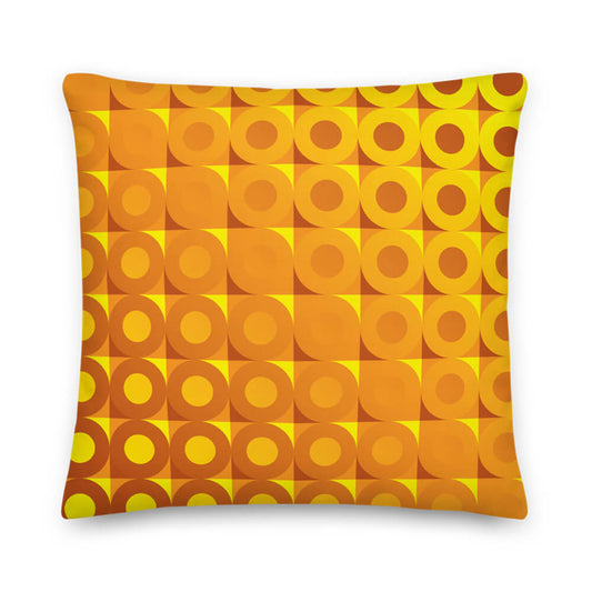
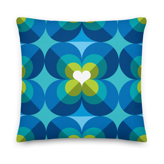
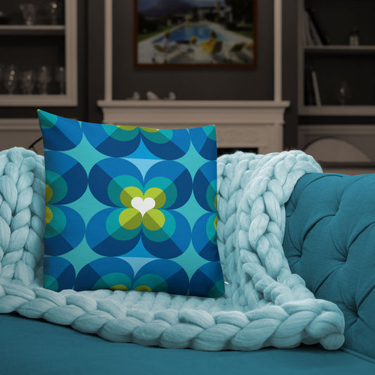
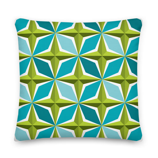
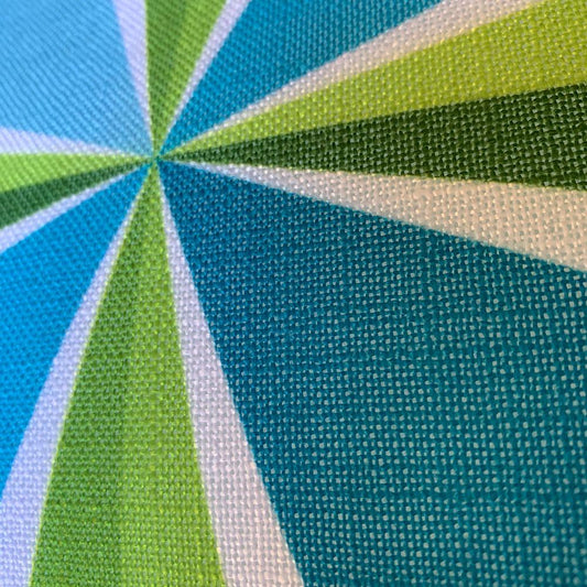
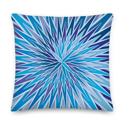
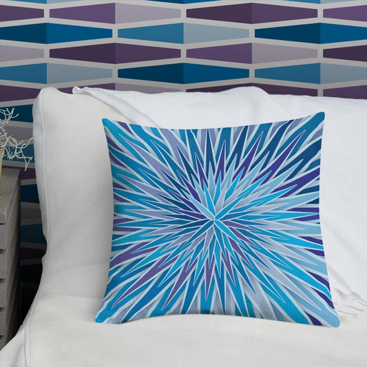
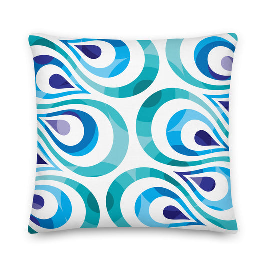
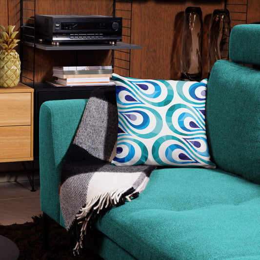
Mid Century Modern Sun Eclipse 18" Square Throw Pillow
Regular price $34.00Regular price -
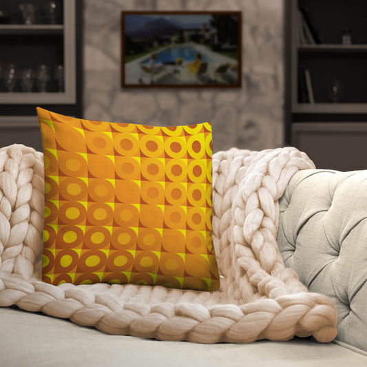
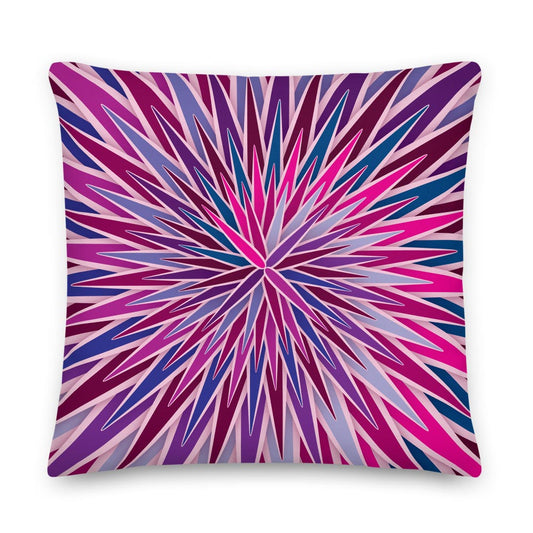
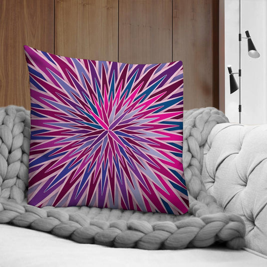
Mid Century Modern Moon Eclipse 18" Square Throw Pillow
Regular price $34.00Regular price


FlowerPower
-
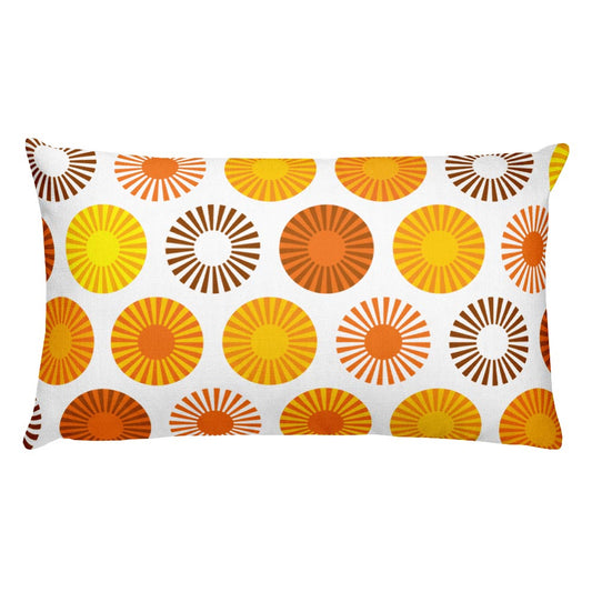
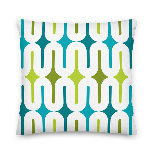
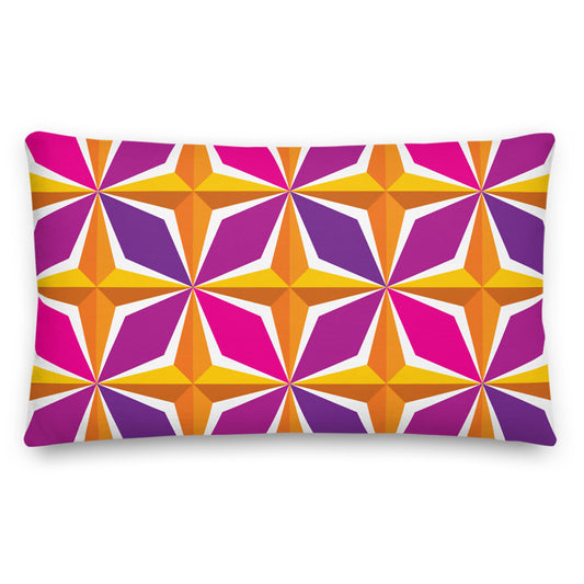
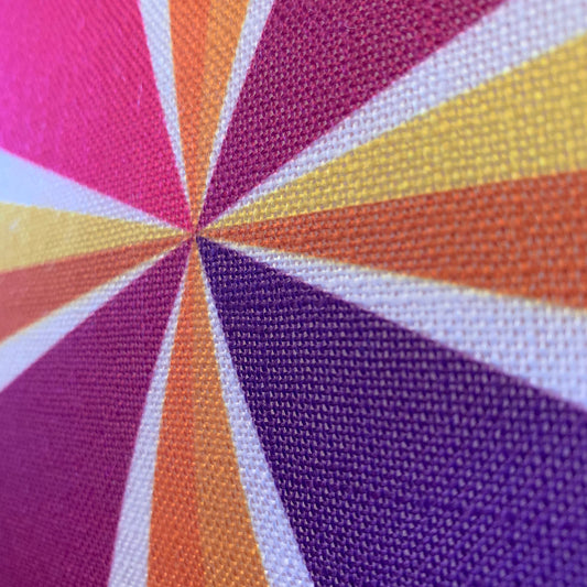
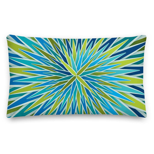
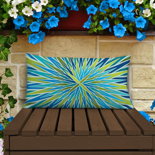
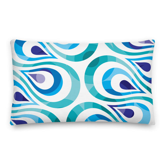
Mid Century Modern Orange FlowerPower 20" x 12" Rectangular Throw Pillow
Regular price $34.00Regular price -
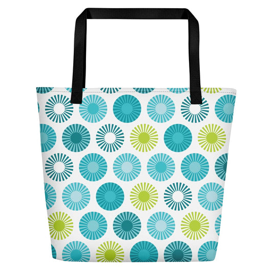
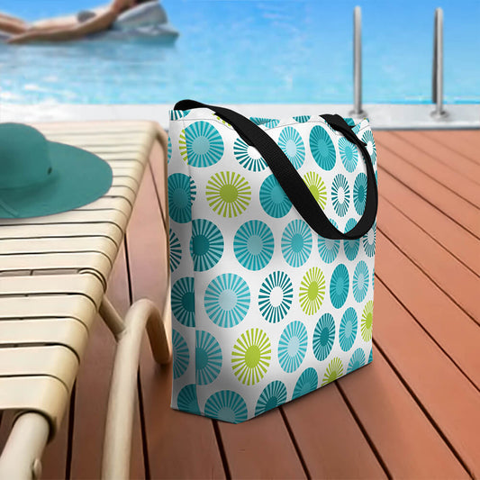
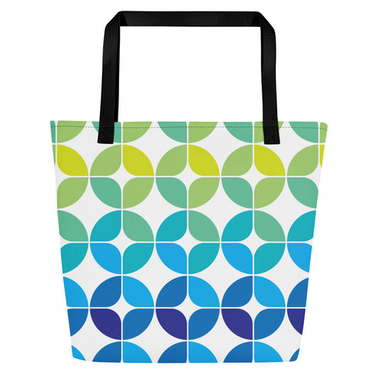
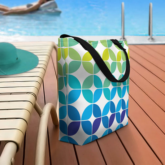
Mid Century Modern Aqua FlowerPower Beach Bag
Regular price $40.00Regular price -
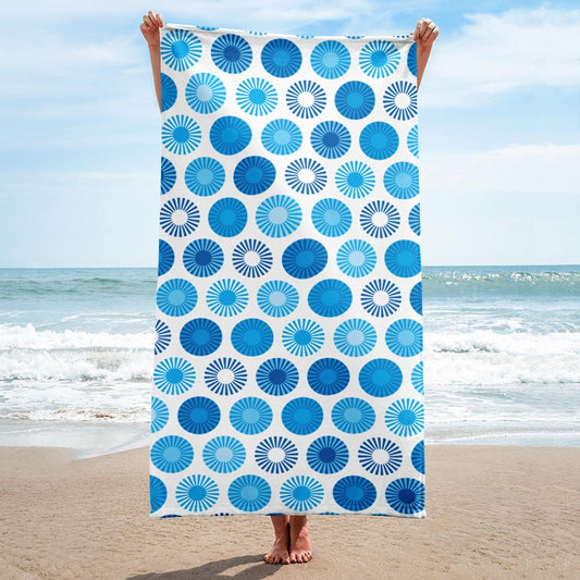
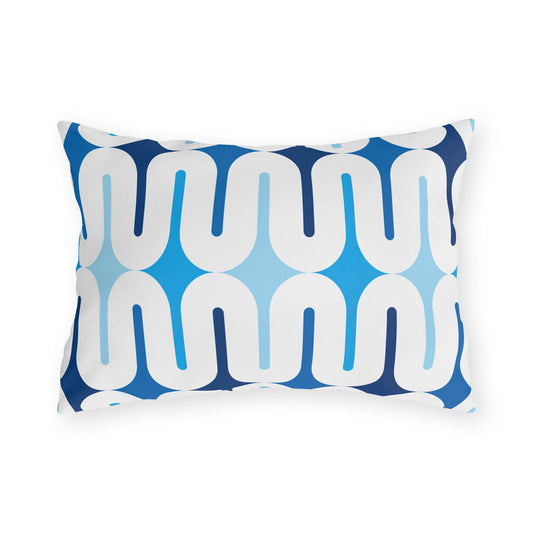
Mid Century Modern Blue FlowerPower Beach & Pool Towel
Regular price $40.00Regular price -
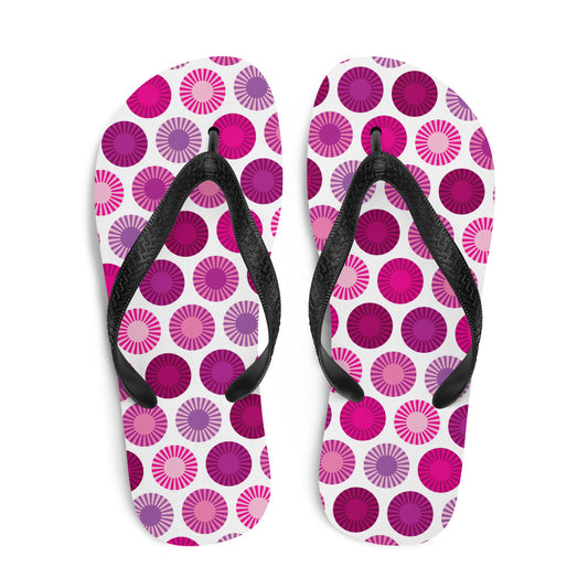
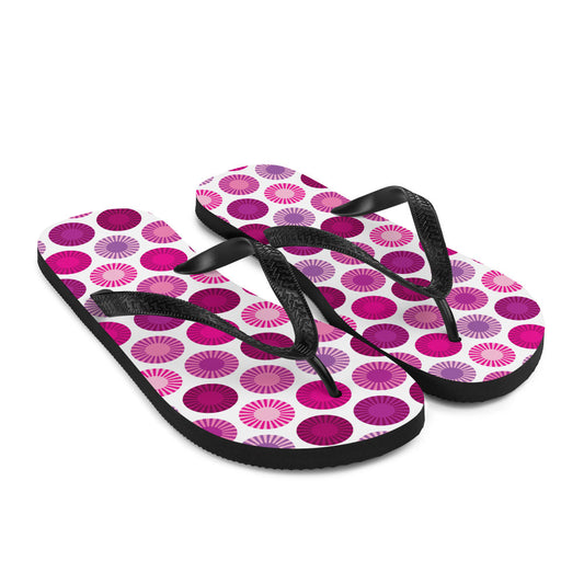
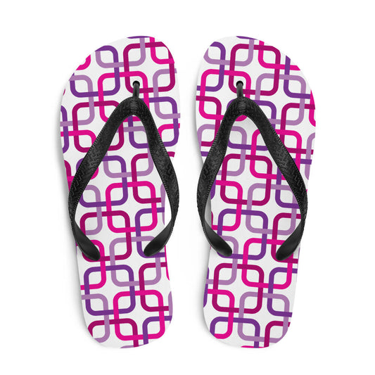
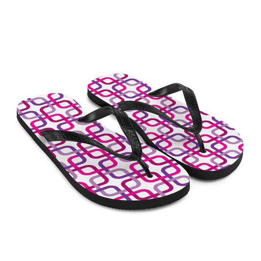
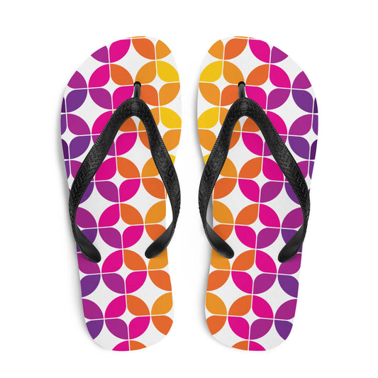
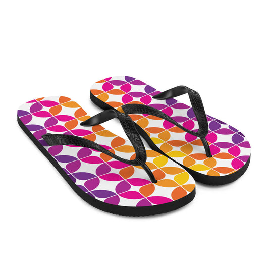
Mid Century Modern Pink FlowerPower Flip-Flops
Regular price $25.00Regular price

Galaxie
-
Mid Century Modern Aqua Green Galaxie 18" Outdoor Pillow
Regular price $36.00Regular price -
Mid Century Modern Blue Galaxie 20" x 14" Outdoor Pillow
Regular price $38.00Regular price -
Mid Century Modern Orange Purple Galaxie 18" Outdoor Pillow
Regular price $36.00Regular price -
Mid Century Modern Yellow Galaxie 20" x 14" Outdoor Pillow
Regular price $38.00Regular price
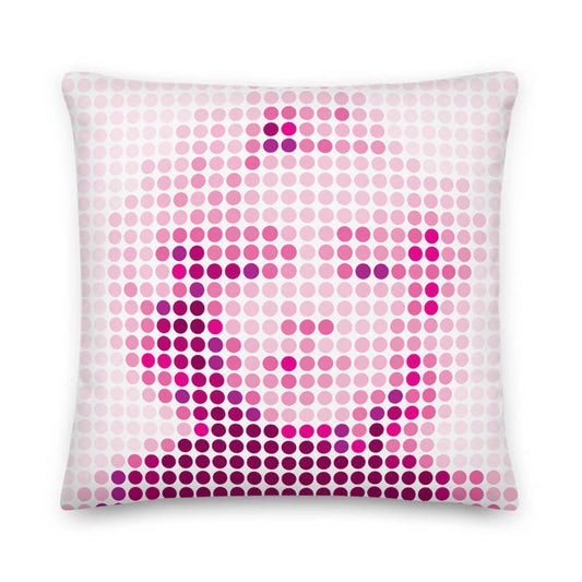
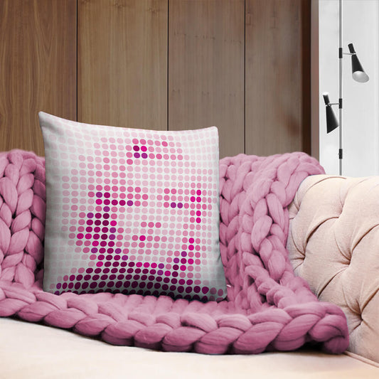
Hollywood StarDots
-
Mid Century Modern Hollywood StarDots Pink Marilyn Monroe 18" Square Throw Pillow
Regular price $34.00Regular price
LifeSavers
-
Mid Century Modern Coral Red LifeSavers 18" Square Throw Pillow
Regular price $34.00Regular price -
Mid Century Modern Orange Yellow LifeSavers 18" Square Throw Pillow
Regular price $34.00Regular price -
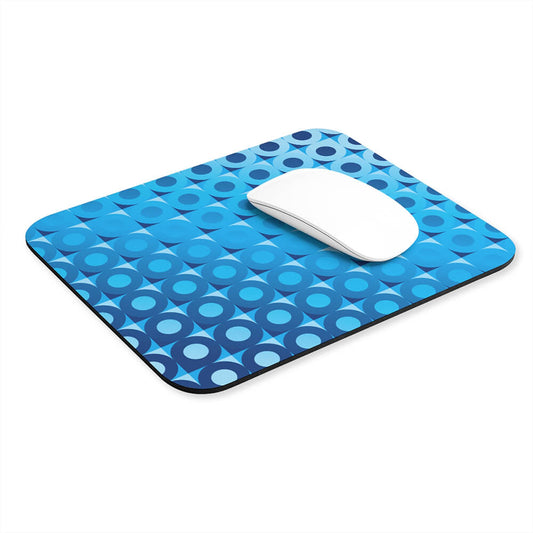
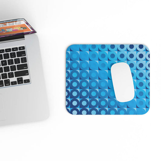
Mid Century Modern Blue LifeSavers Rectangular Mouse Pad
Regular price $15.00Regular price -
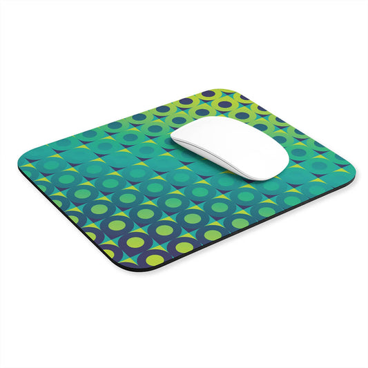
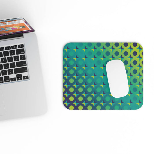
Mid Century Modern Aqua Green LifeSavers Rectangular Mouse Pad
Regular price $15.00Regular price
LoverLeaf
-
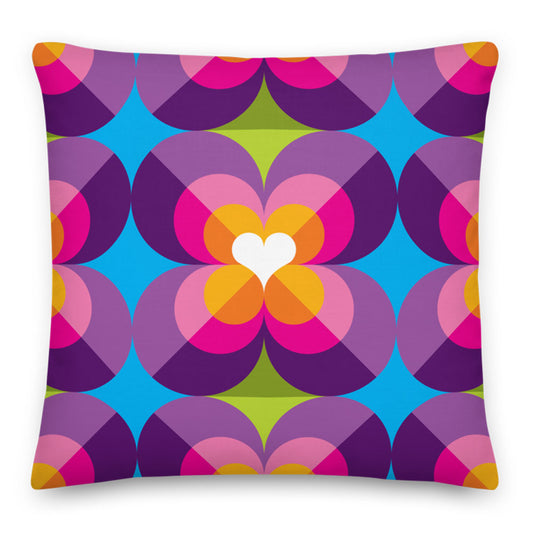
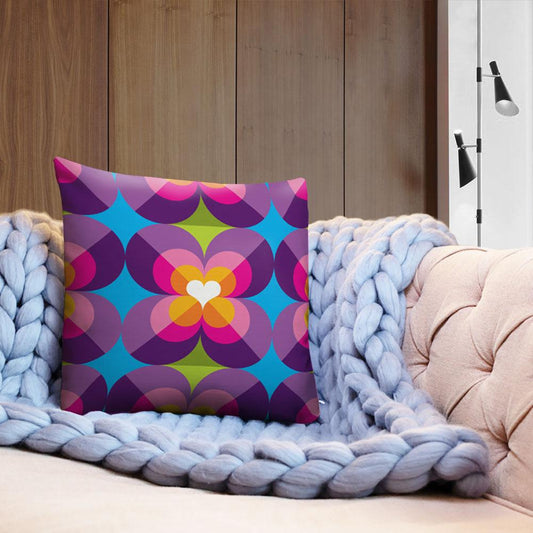
Mid Century Modern Purple Blue LoverLeaf 18" Square Throw Pillow
Regular price $34.00Regular price -
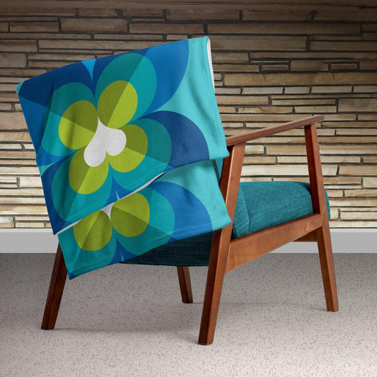
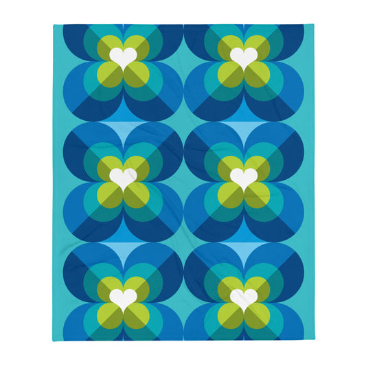
Mid Century Modern Aqua Blue LoverLeaf 50" x 60" Throw Blanket
Regular price $50.00Regular price -
Mid Century Modern Aqua Blue LoverLeaf Beach Bag
Regular price $40.00Regular price -
Mid Century Modern Aqua Blue LoverLeaf 18" Square Throw Pillow
Regular price $34.00Regular price
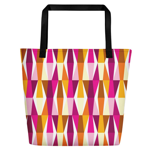
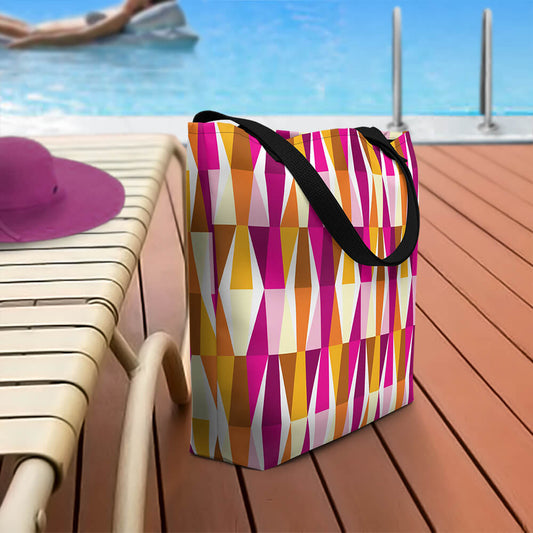
LozAnges
-
Mid Century Modern Aqua Green LozAnges 20" x 12" Rectangular Throw Pillow
Regular price $34.00Regular price -
Mid Century Modern Orange Pink LozAnges Beach Bag
Regular price $40.00Regular price -
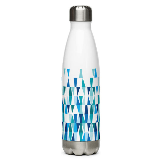
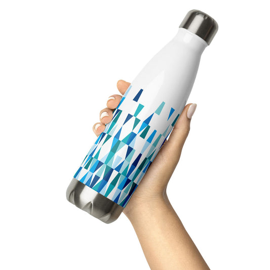
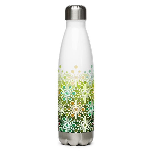
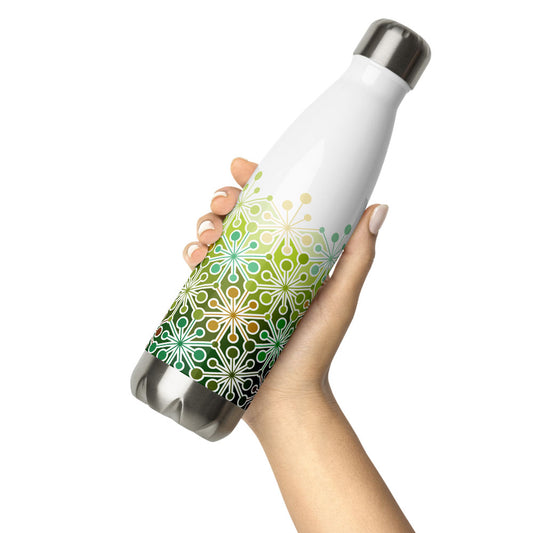
Mid Century Modern Blue Aqua LozAnges 17 oz Stainless Steel Designer Water Bottle
Regular price $40.00Regular price -
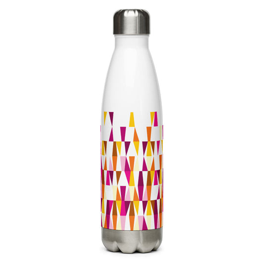
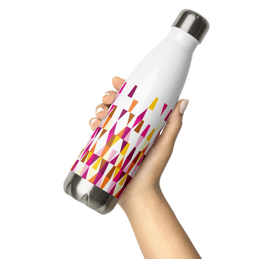
Mid Century Modern Orange Pink LozAnges 17 oz Stainless Steel Designer Water Bottle
Regular price $40.00Regular price
PanAmTrays
-
Mid Century Modern Multicolor PanAmTrays 15oz Mug
Regular price $25.00Regular price -
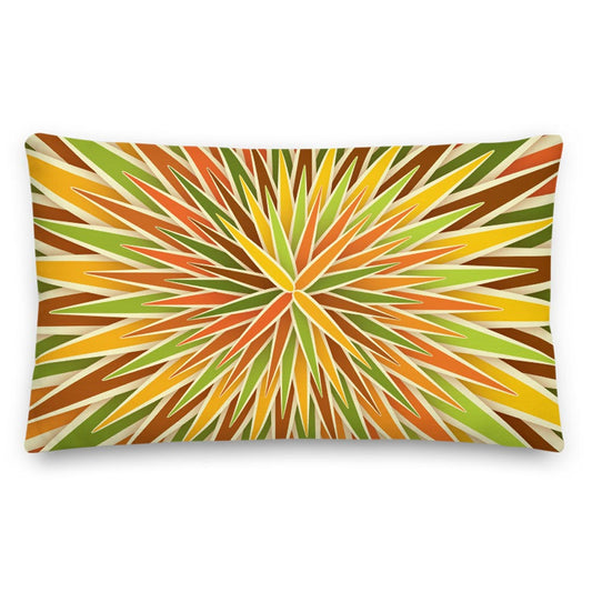
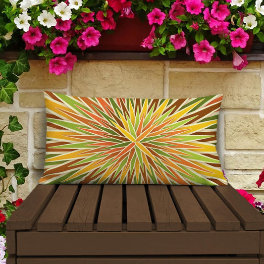
Mid Century Modern Orange PanAmTrays 20" x 12" Rectangular Throw Pillow
Regular price $34.00Regular price -
Mid Century Modern Blue PanAmTrays Beach Bag
Regular price $40.00Regular price -
Mid Century Modern Pink PanAmTrays Flip-Flops
Regular price $25.00Regular price


PolaRise
-
Mid Century Modern Aqua Green PolaRise 50" x 60" Throw Blanket
Regular price $50.00Regular price -
Mid Century Modern Orange Pink PolaRise 50" x 60" Throw Blanket
Regular price $50.00Regular price -
Mid Century Modern Aqua Green PolaRise 18" Square Throw Pillow
Regular price $34.00Regular price -
Mid Century Modern Orange Pink PolaRise 20" x 12" Rectangular Throw Pillow
Regular price $34.00Regular price
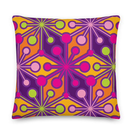
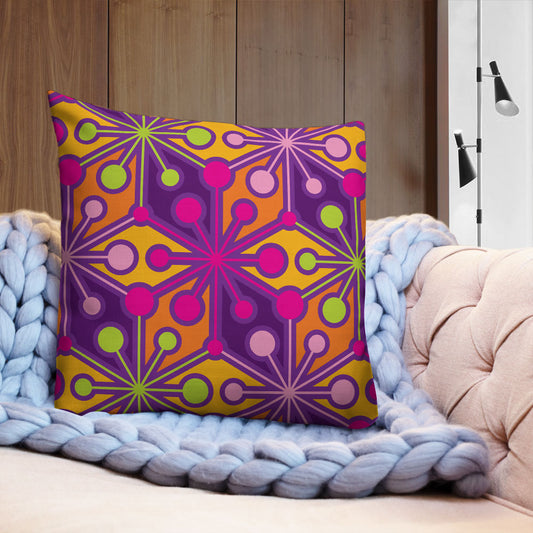
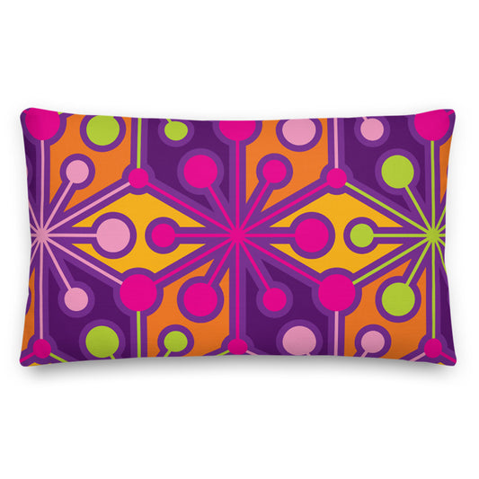
PsychoFlakes
-
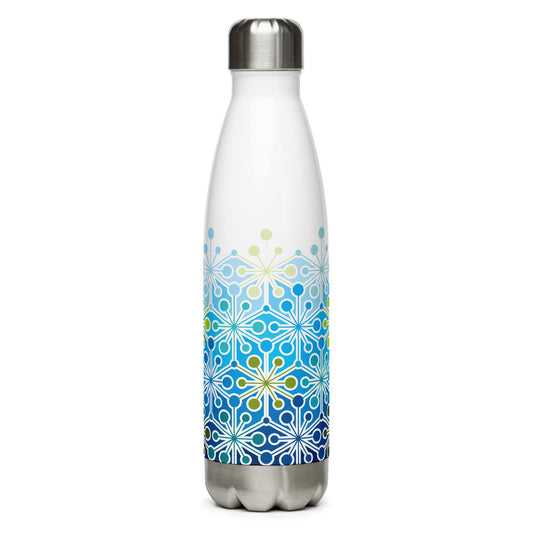
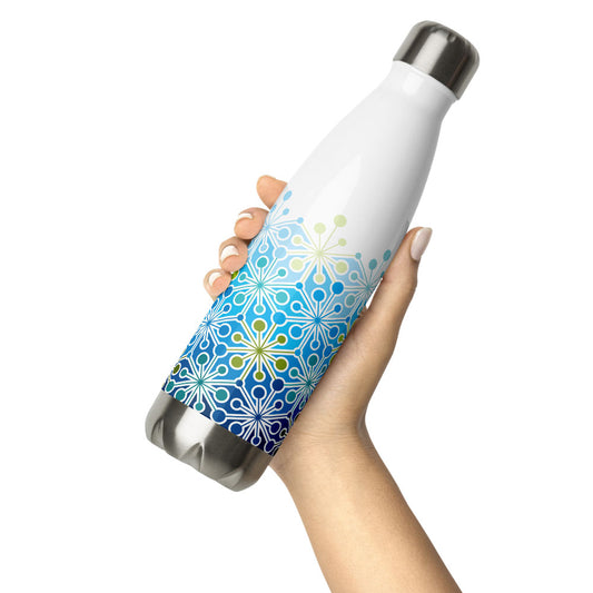
Mid Century Modern Icy Blue PsychoFlakes 17 oz Stainless Steel Designer Water Bottle
Regular price $40.00Regular price -
Mid Century Modern Multicolor PsychoFlakes 18" Square Throw Pillow
Regular price $34.00Regular price -
Mid Century Modern Multicolor PsychoFlakes 20" x 12" Rectangular Throw Pillow
Regular price $34.00Regular price -
Mid Century Modern Eco Green PsychoFlakes 17 oz Stainless Steel Designer Water Bottle
Regular price $40.00Regular price
SpiroBurst
-
Mid Century Modern Orange Green SpiroBurst 20" x 12" Rectangular Throw Pillow
Regular price $34.00Regular price -
Mid Century Modern Purple Pink SpiroBurst 22" Square Throw Pillow
Regular price $42.00Regular price -
Mid Century Modern Aqua Green SpiroBurst 20" x 12" Rectangular Throw Pillow
Regular price $34.00Regular price -
Mid Century Modern Blue Indigo SpiroBurst 18" Square Throw Pillow
Regular price $34.00Regular price
StarChips
-
Mid Century Modern Blue Aqua StarChips Beach Bag
Regular price $40.00Regular price -
Mid Century Modern Blue Aqua StarChips Beach & Pool Towel
Regular price $40.00Regular price -
Mid Century Modern Purple Orange StarChips Flip-Flops
Regular price $25.00Regular price -
Mid Century Modern Black and White StarChips 15oz Mug
Regular price $25.00Regular price

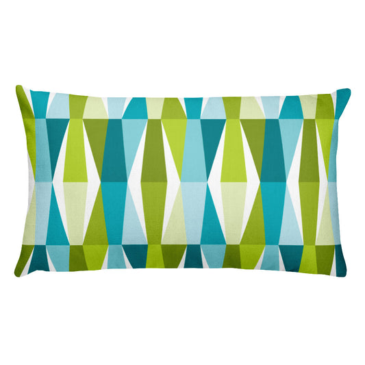
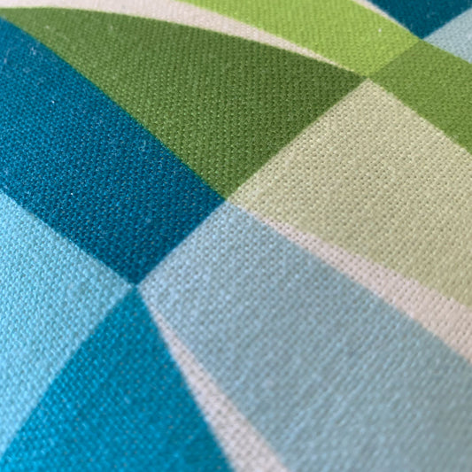
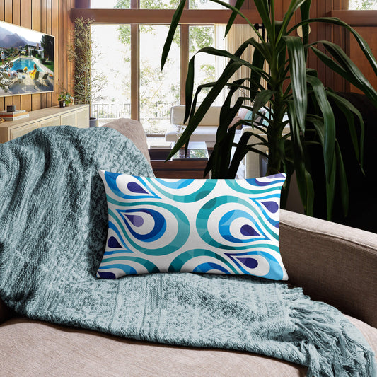
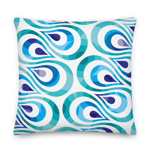
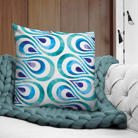
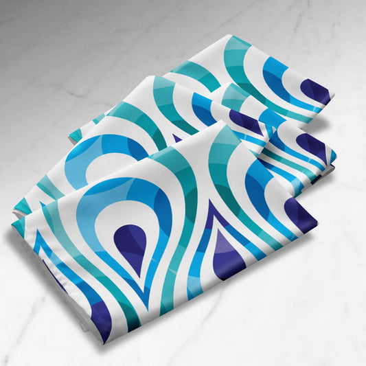
TearDrops
-
Mid Century Modern Aqua Blue TearDrops 18" Square Throw Pillow
Regular price $34.00Regular price -
Mid Century Modern Aqua Blue TearDrops 20" x 12" Rectangular Throw Pillow
Regular price $34.00Regular price -
Mid Century Modern Aqua Blue TearDrops 22" Square Throw Pillow
Regular price $42.00Regular price -
Mid Century Modern Aqua Blue TearDrops Cloth Napkins Set of 4
Regular price $36.00Regular price

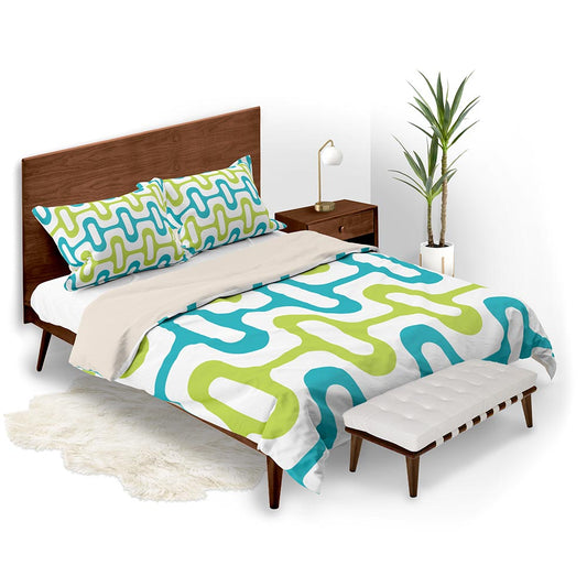
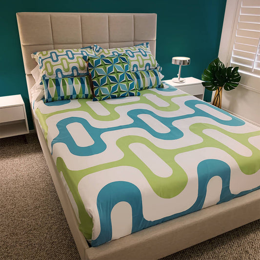
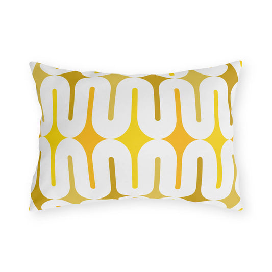
ZipperDee
-
Mid Century Modern Aqua Green ZipperDee Duvet Cover
Regular price From $115.00Regular price -
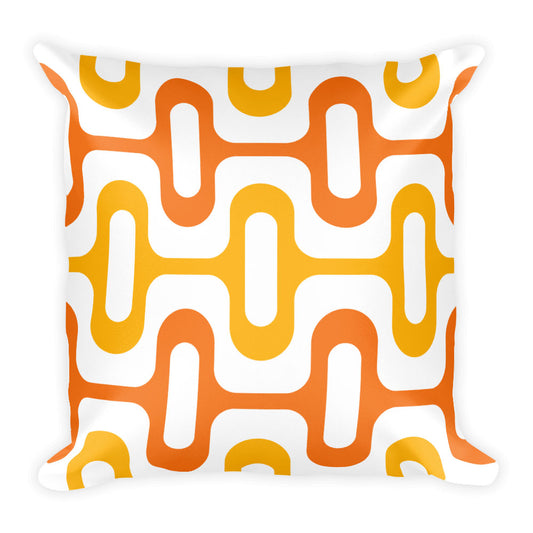
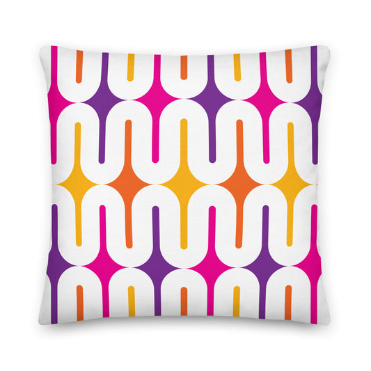
Mid Century Modern Orange ZipperDee 18" Square Throw Pillow
Regular price $34.00Regular price -
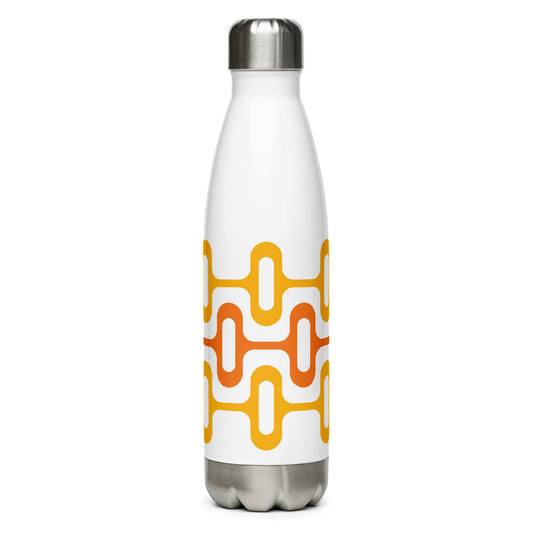
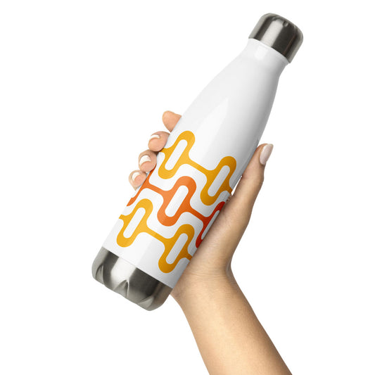
Mid Century Modern Orange ZipperDee 17 oz Stainless Steel Designer Water Bottle
Regular price $40.00Regular price -
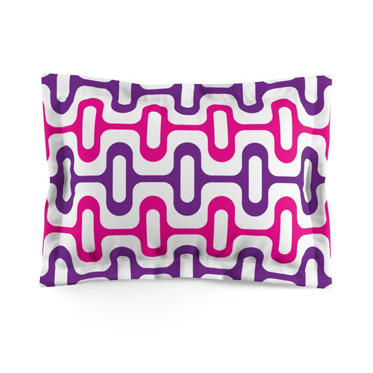
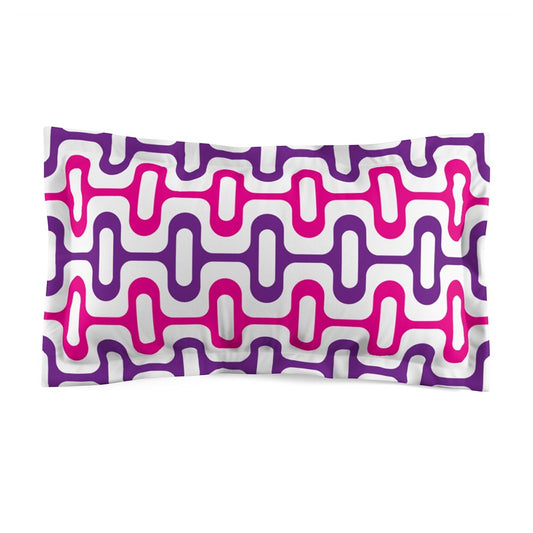
Mid Century Modern Purple Pink ZipperDee Pillow Sham with flange
Regular price From $35.00Regular price