How a new collection comes to life – A design journey into creating mid-century designs from scratch and finding a name
Share

Here's an insight on how I get inspired, search, and create a new collection. For this fun blog post, I'll use the latest collection I designed: SunKissed.
First, there's usually a creative spark. In this case, it was the image "Fresh-Squeezed Savings" in a newsletter from the grocery store Ralphs, as you can see above, with beautifully photographed orange, lemon, and lime. My first thought was how those basic fruity colours make such a nice mid-century mix, and how California fruits are iconic. I never thought of mid-modern colours to be derived from fruits or nature but there it was, so obvious and appealing. I was already visualizing a pattern with similar shapes. All this inspiration was calling me to try something out as soon as possible.
I wasn't too busy that day. After clearing up my regular graphic design schedule, I turned to Adobe Illustrator, my sofware of choice, and started researching. That step is quite decisive for what happens next. I sometimes start by scribbling on paper but this time I did not. The crescent shape became obvious very rapidly and I took it from there. Early in the process, I realized that all of my first designs were creating visual stripes when on a product. Once I decided to zoom up and make the pattern bigger for boldness, those stripes were an even bigger problem. I switched my research around to find a solution and get rid of those stripes. That's when a wavy style became obvious. With lots of trials and errors, I was able to design one single shape that could be rotated 180° and be used indefinitely, as the one and only shape required for the whole pattern and in every colour. That took way too long to achieve but the result is amazing. If you don't know me yet, that's my meticulous craziness!
Next came the colours. After a bit of tests, the orange-lemon-lime was good to go but I felt compelled to offer more variations and I had no guidance or preference. So I left it aside to see if some name research would bring the inspiration for the colours. In design, you always want to keep your options open and not get stuck by either shape, style or colour.
That research went really well, very quickly. Of course, I was aiming at something around fruits. On my first keyword search, I was pointed to the Sunkist brand website and Wikipedia page. That's how I found out about the rich history of the California Growers, plus the origin and story of the Sunkist name and iconic brand. Wow, what an incredible marketing journey. My designer brain was in overdrive and I was taking notes. Sunkist is more about citrus with gorgeous colours like orange, lemon, lime, grapefruit. Those were definitely keepers. To stay in the same spirit, I expanded my online search on California fruits and set my mind on "berries" (pink & violet) and "grapes" (blue & green). But those new colours had to be fruity and vibrant. I needed to tweak my usual palette a bit. For 3 years, I've been staying course on the same custom palette system that I especially designed for my store products (more info here #17). Taking the decision to digress a bit wasn't easy but worth it. You won't see a huge difference of course but I know it's there and that door is now open, for the best!
So now, I had my colour options. For the name, a little snippet of info got my attention: the first name proposed by an agency to the Coop of California Growers Inc was "Sun-Kissed". But they got afraid of copyright issues, since it's a regularly worded expression, so they worked on a more unique and proprietary denomination and came up with Sunkist. Quite ingenious! With the innovation of TV in the fifties, Sunkist became a ubiquitous brand, making quite a mark in mid-century advertising memorabilia. To honour that wonderful legacy, I decided to pick on that first iteration and called the collection SunKissed (in one word, like I always do). I wanted this collection to reflect the constant sunshine of beautiful Palm Springs where citrus grows in my own backyard so easily. From December to February, I'm blessed with the most amazing grapefruits, oranges, lemons and limes, at arm's reach. With colours chosen for 3 options, and a fun meaningful name settled on, it was time to get back to my designs.
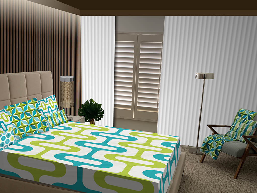
The last step was really what I often call a kitchen recipe. Now that all the final ingredients are ready to roll, all that's left to do is mix and adjust the recipe until ready to bake: shapes, pattern, colours, background, size, overall fit. You can see in the header image a glimpse of that evolution. By the way, this is the very first collection that I fine-tuned the pattern for all 3 pillows at the same time so that they can all share the same "tile" size, instead of one big image that is resized to fit on all products. In that new way, if you ever buy the 3 throw pillow sizes (currently 22", 18", 20" x 12"), the curves of the design are the same and fit better together. Not all designs would benefit from that but here, it's a nice detail.
The process of final adjustments is often the most tedious part of the design work but at this point, it was just versioning over and over again until perfectly mixed. Along the way, the secret is to stop everything once in a while and try it out on products. My manufacturer offers an amazing online 3D modelling tool that makes testing designs on real products easy and instantaneous. This is often a deal breaker as some designs look great when flat but when wrapped around an object, it can be a completely different result. Once I'm happy with how things turn out, all there is left is putting it online for you to enjoy and hopefully order! But that too, putting it online, takes an incredible amount of steps: webpage, titles, description, image alt text, collection kit, sku, price, shipping, samples, pictures, video, YouTube, Instagram, etc. It can make your head spin but that's another story...
So there you have it! It's quite a long process. Most collection design work spans over a few weeks, even years, and sometimes they don't even make the cut. I have a ton of unfinished designs like Hollywood Dots (Marilyn & Sinatra are in the works), NeonGlow, PatsyOh (Patsy Cline +patio, one of my favourite names!), Cactus, Chevrons, Houndstooth, and let's not forget my now infamous Zesty-Koko-Margot-Rita characters concept that never seems to see the light of day. My close friends are getting tired of asking how this one's going... Other times, like for SunKissed, the first set of throw pillows was online at the end of a single very long day! You can check them out here.
As I'm writing this post, this new collection has been online just a few days now, without fanfare. I'll be launching it online at the shop's Instagram account and Facebook page, and I'm about to order samples during the week. Watch this space for one of my fun unpacking videos. Until then, stay safe and don't forget to spice up your life with colourful mid-century home decor!


